inQUEST is a company that specializes in DEI (diversity, equity, inclusivity) training for teams. They reached out to us to develop a new platform for their training software. I was tasked with designing the app's UI.
The Brief
inQUEST software is used to host a range of diversity & inclusion training workshops. We needed to build a system that was flexible enough to work with any content that might get added in the future. Additionally, since the product is intended for a corporate environment, the interface needed to be approachable to users of all technical levels.
Design Inspiration
inQUEST already had a logo and brand when they approached us, so those elements were used as a starting point. But we still needed to explore the look & feel that the app would have, as well as the interaction style. We presented the client with two mood boards: one that leaned more professional, and another more playful.
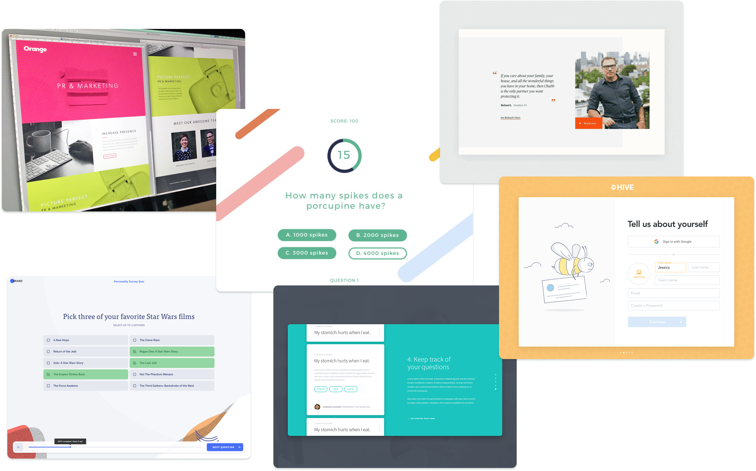
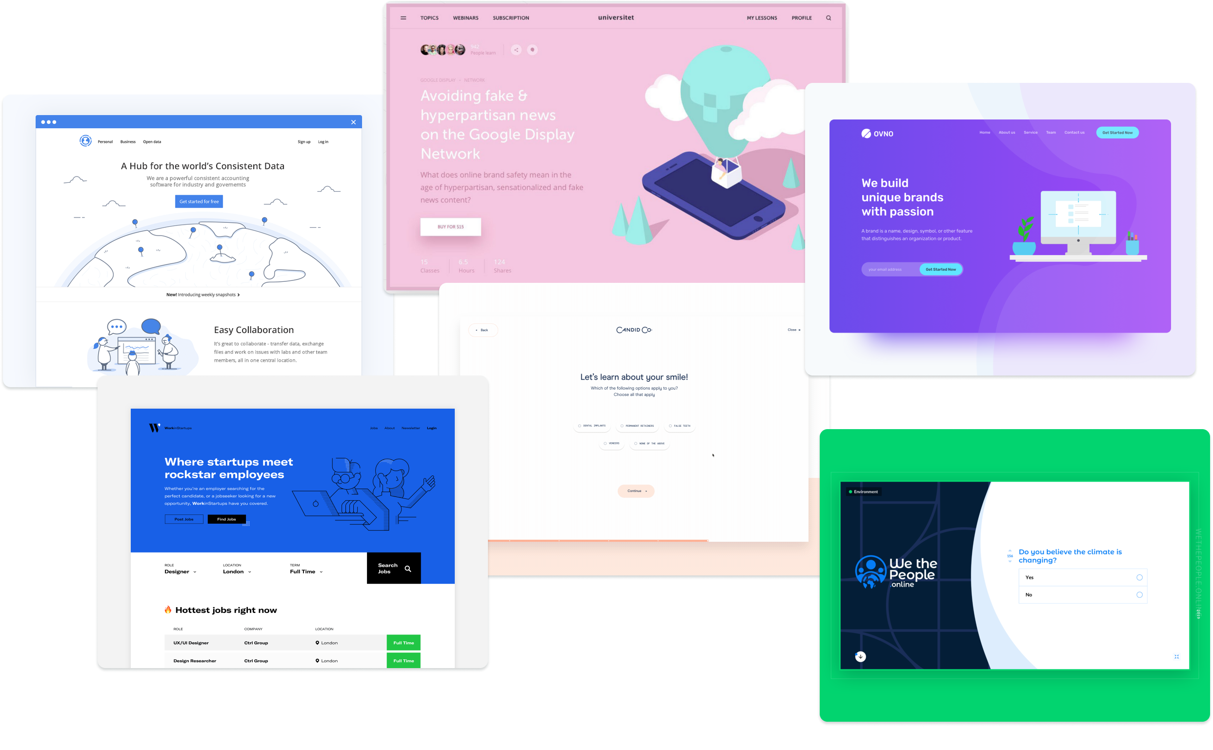
In the end, elements from both boards were used to create the final look.
Colors & Styles
Colors were pulled from inQUEST's brand, with additions made to improve accessibility and usability. Neutral tones are used where possible in order to allow the use of color to guide users through the proper interactions.
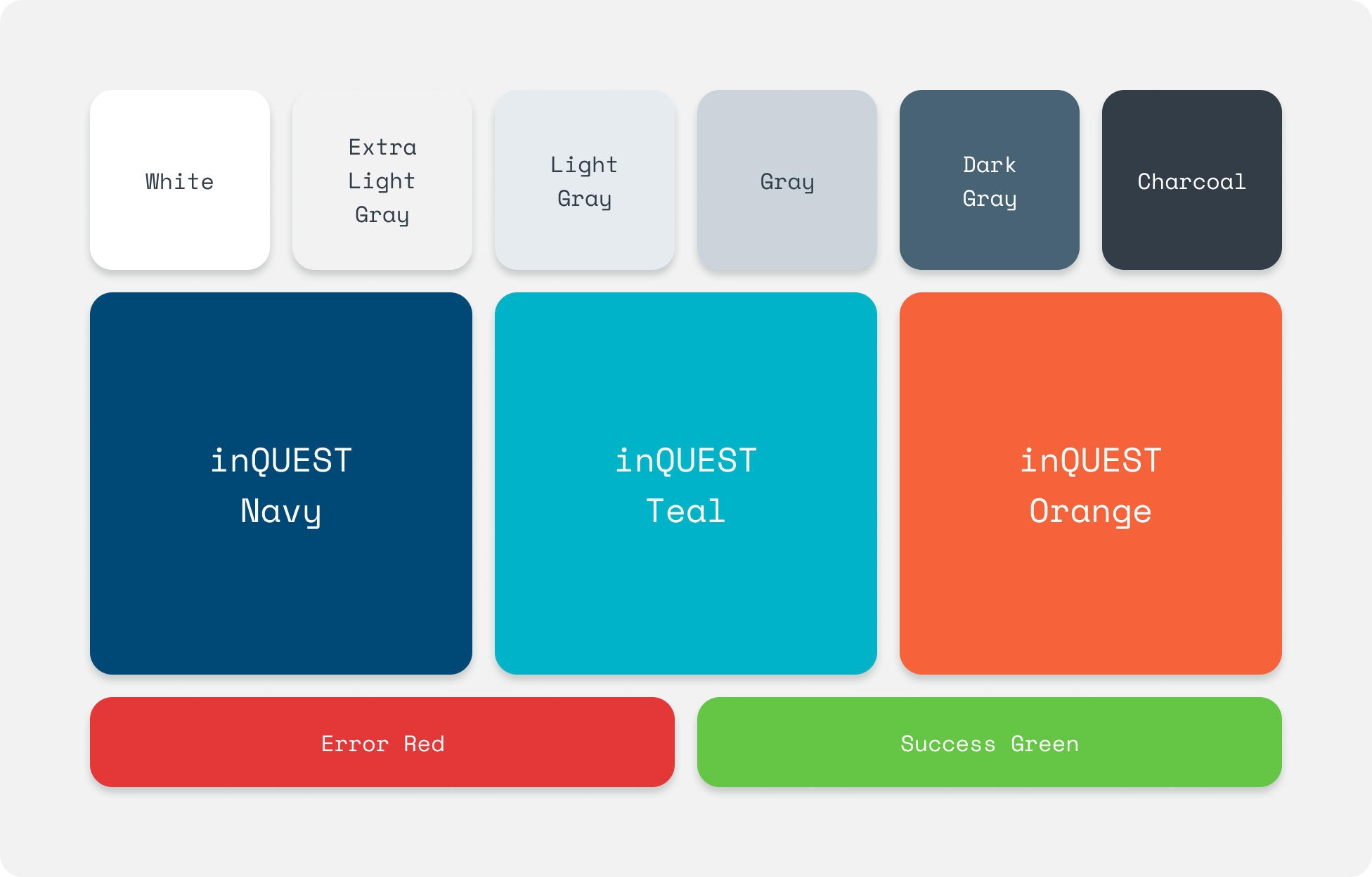
The visual style is bold and flat. Drop shadows are included only on interactive items, in order to give them a sense of depth that helps users understand what items can be interacted with. Question response elements always start off white, with distinct visual styles for different states. Error and success states have icons in addition to their color fills in order to stand out more from selected states, even for users with color blindness or using low-contrast displays.
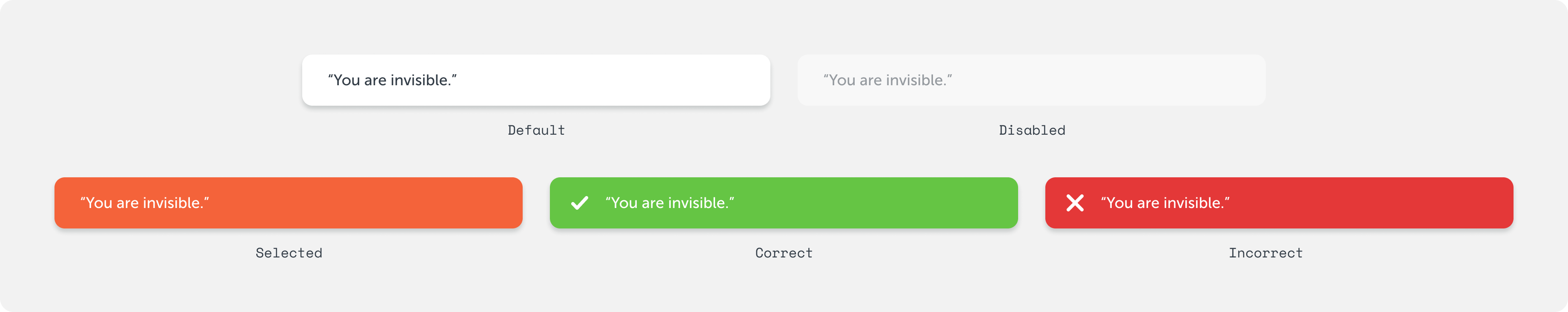
Module content is always displayed on a light gray background, so interactive question elements were designed specifically with that color in mind.
The Product
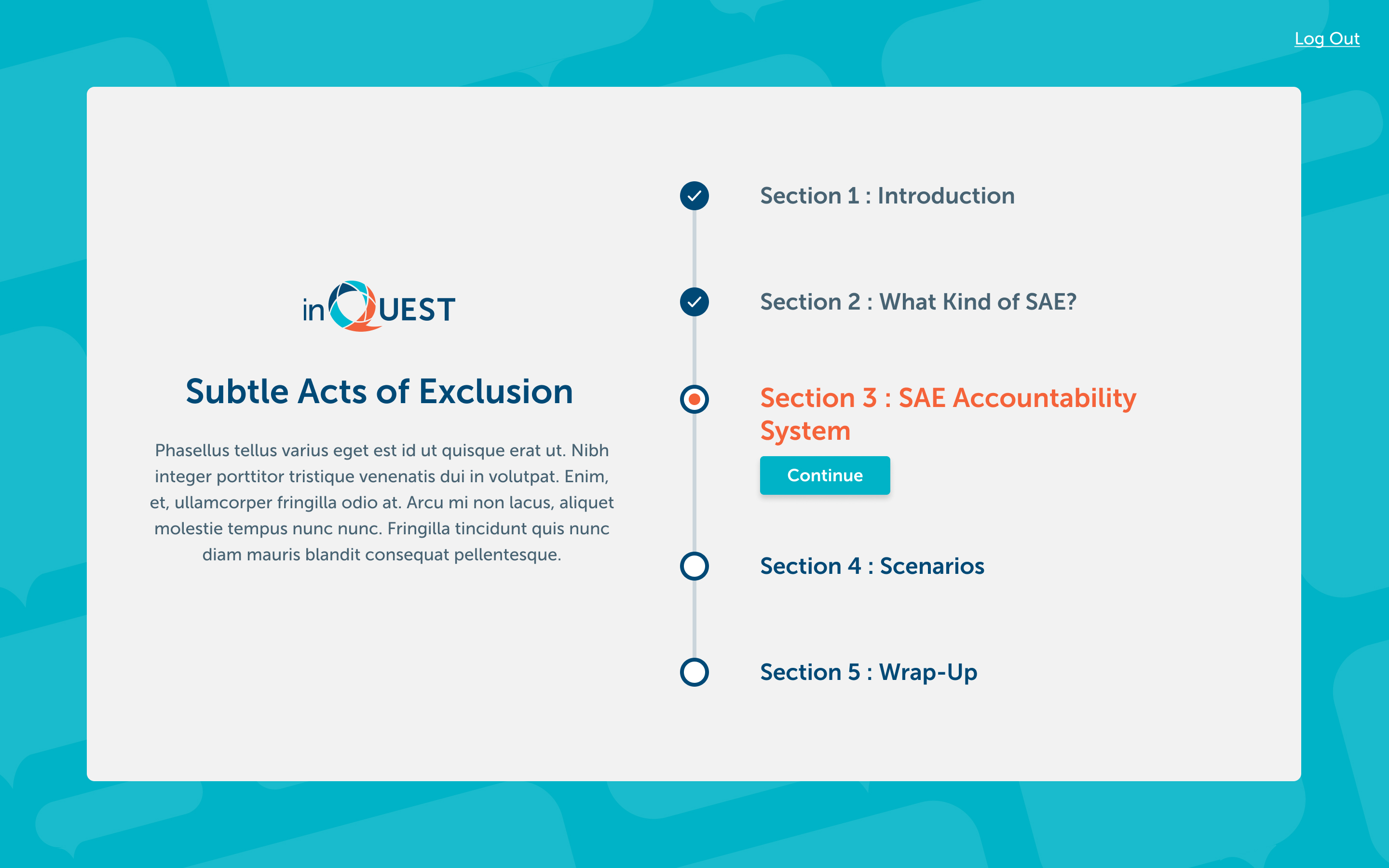
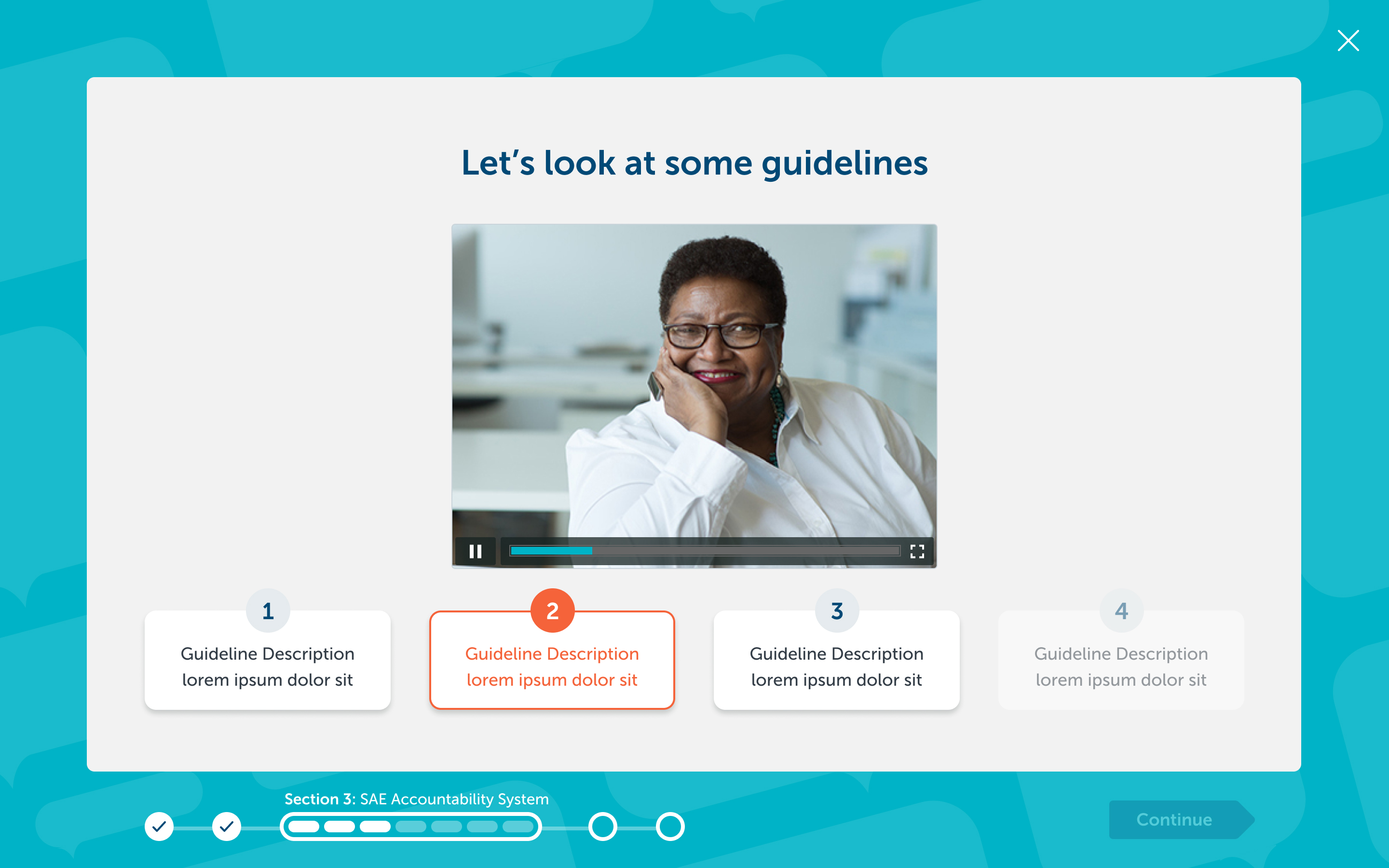
Each training course within the system is called a module, and each module can have a number of sections within it. Users may stop the program at any time and continue from the section at which they left off. Every module starts with an overview screen that contains a short description of the content as well as a list of sections. Users can see which sections they've completed as well as the section they are currently on.
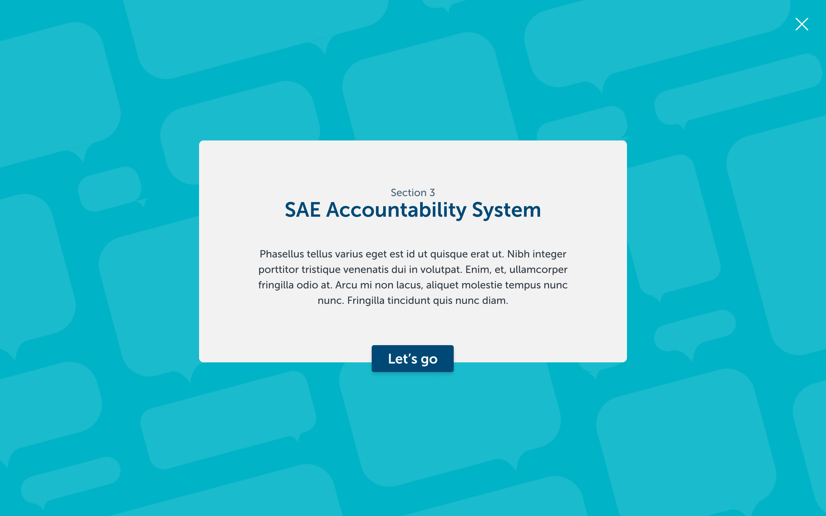
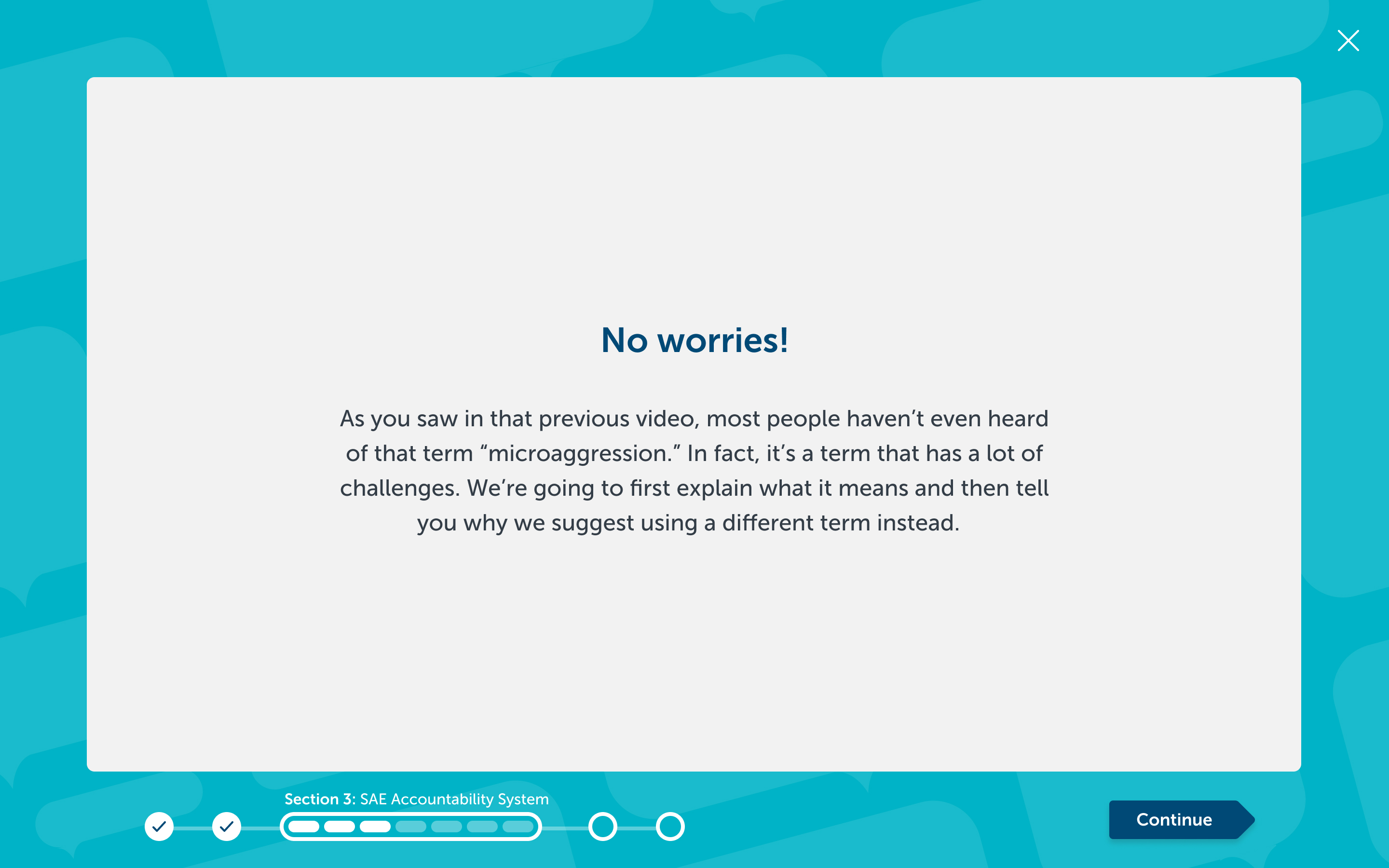
Every section has its own title and descriptive text, as well. This additional copy is used to help explain to users what type of interactions they can expect from the section, another way to reduce friction.
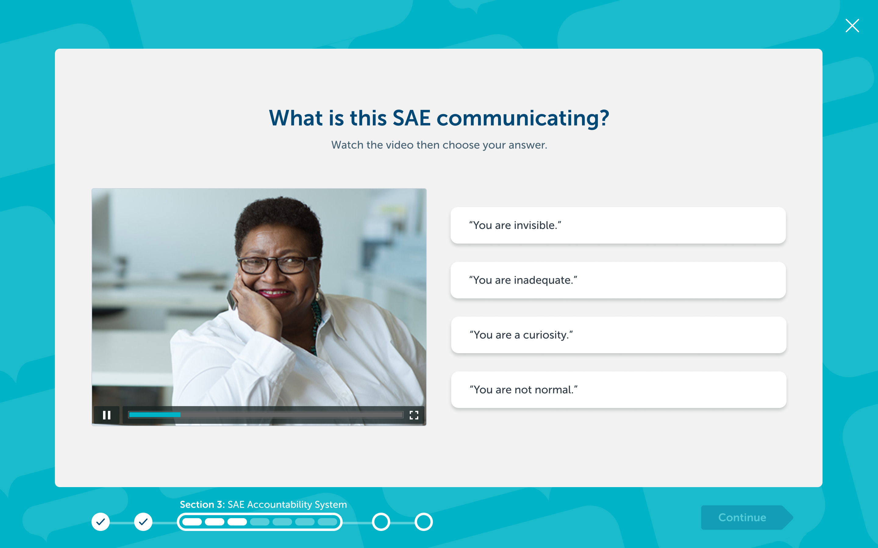
Interactive screens all have a frame around them that contains a progress indicator, the continue button, and an exit button. These elements are present on every view except for alert-style views such as success screens. Users can track their progress within the module as a whole as well as within their section. The continue button — which is the only button with an arrow shape — remains disabled until the user has completed the required task on the page. The user is ideally given only a single possible interaction (aside from exiting) at a time.
Several types of screens were designed to accommodate different styles of question and information that may be presented. These styles are based on the client's stated needs.
Text-only Display
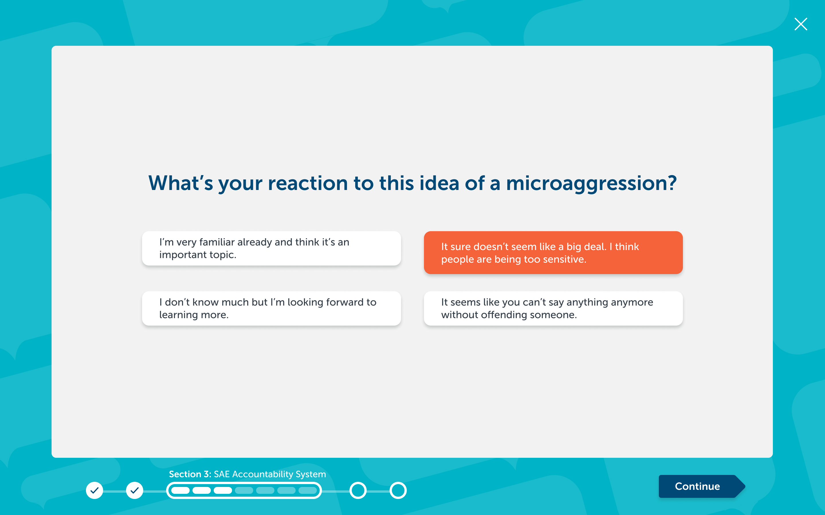
Multiple-choice question
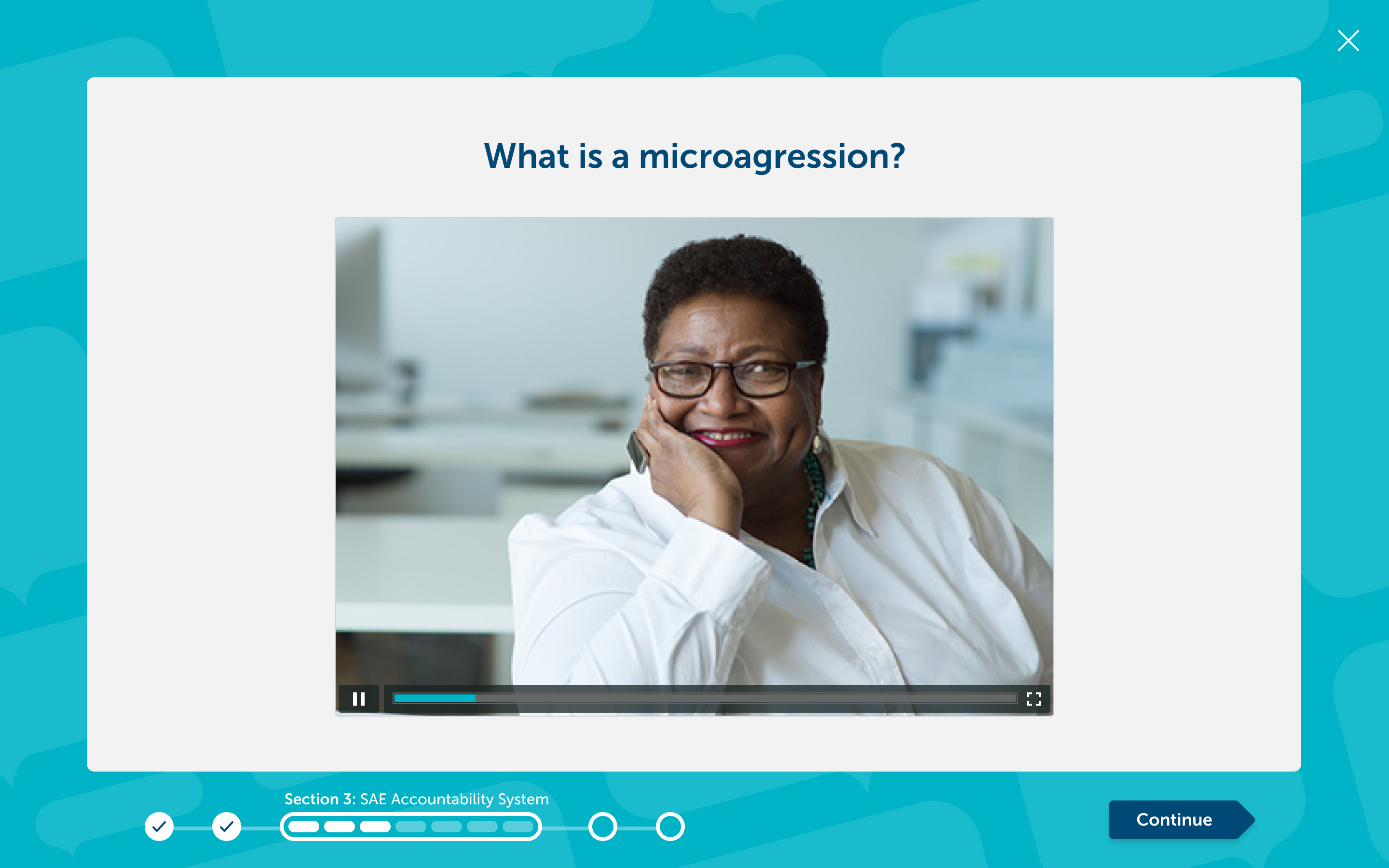
Single-video view
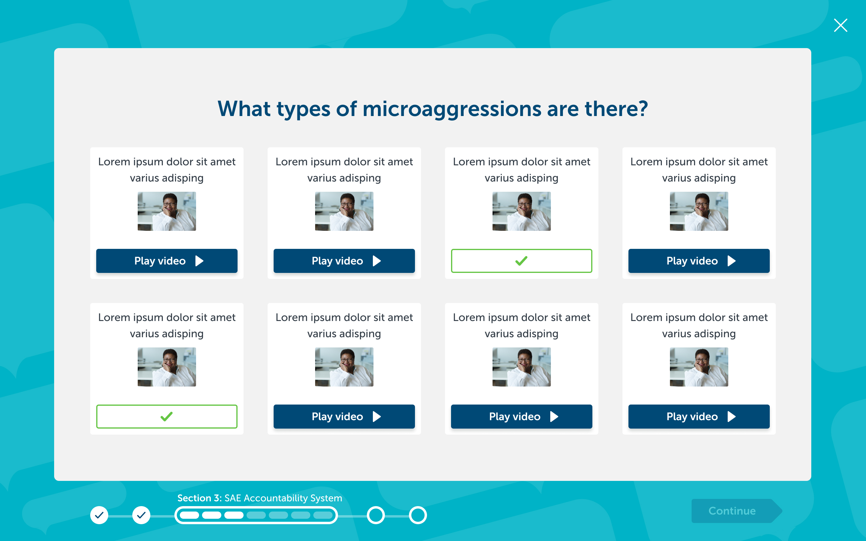
Multi-video view
Ordered video view
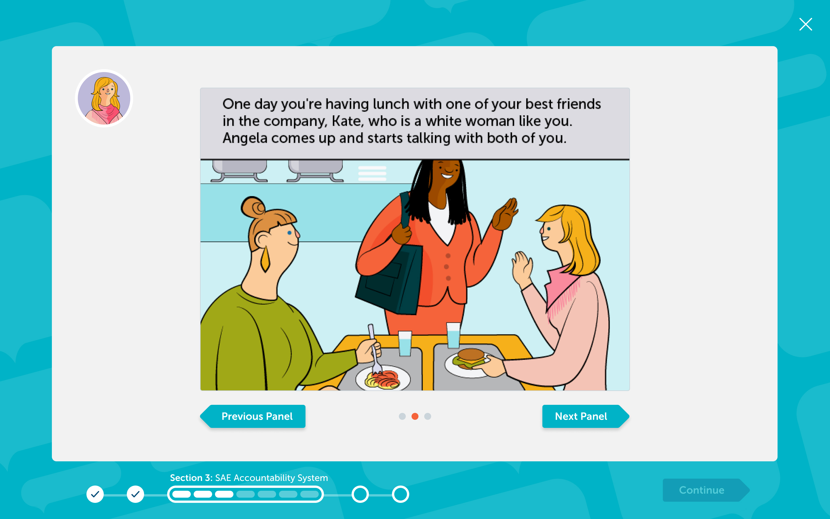
Visual scenario
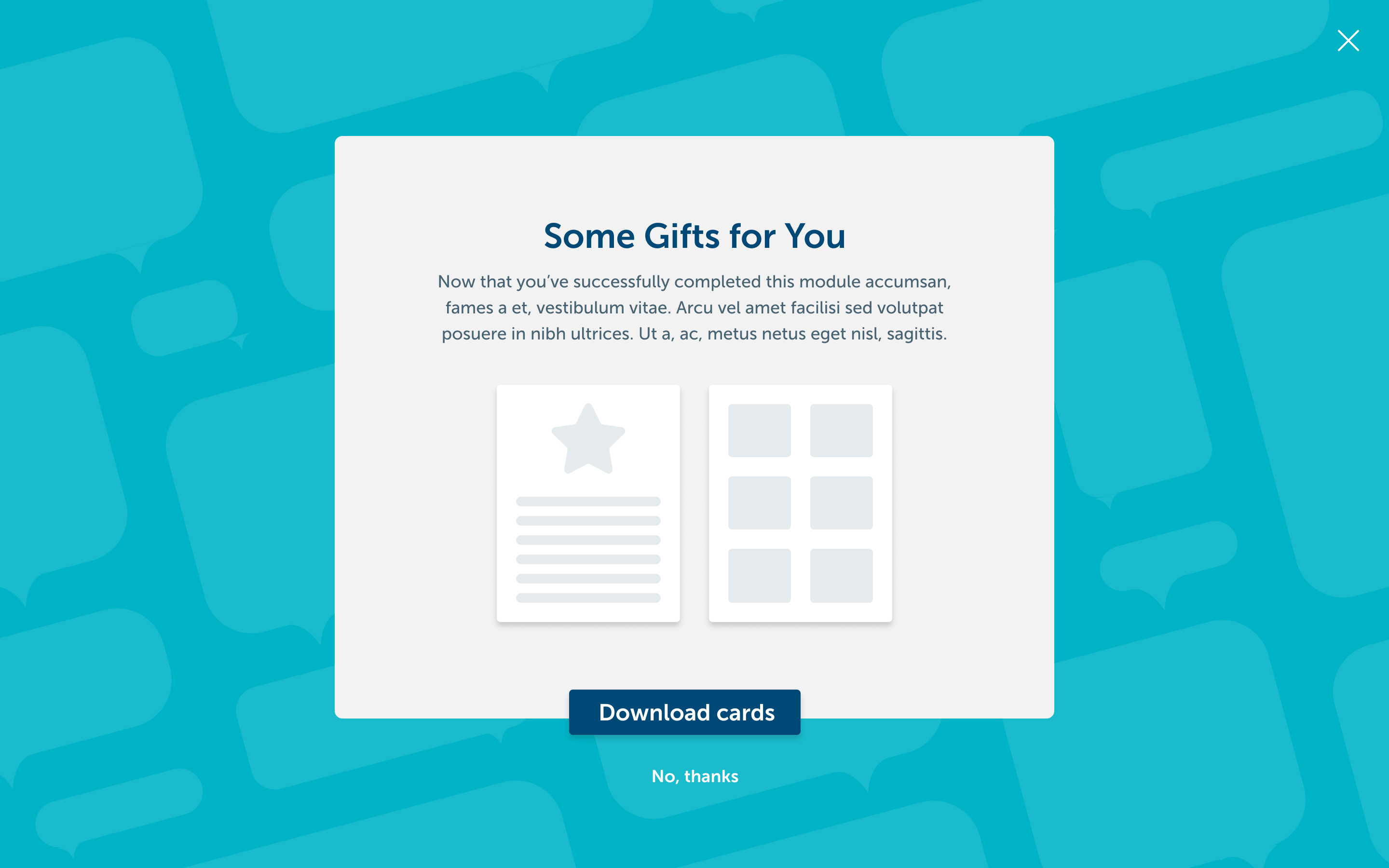
At certain points, generally the end of a module, users are able to download a take-home document with additional practice cards.
For the completion of both sections as well as modules, a new success screen was designed. This screen is given more energy, as well as some animations, in order to engage users and keep them motivated.
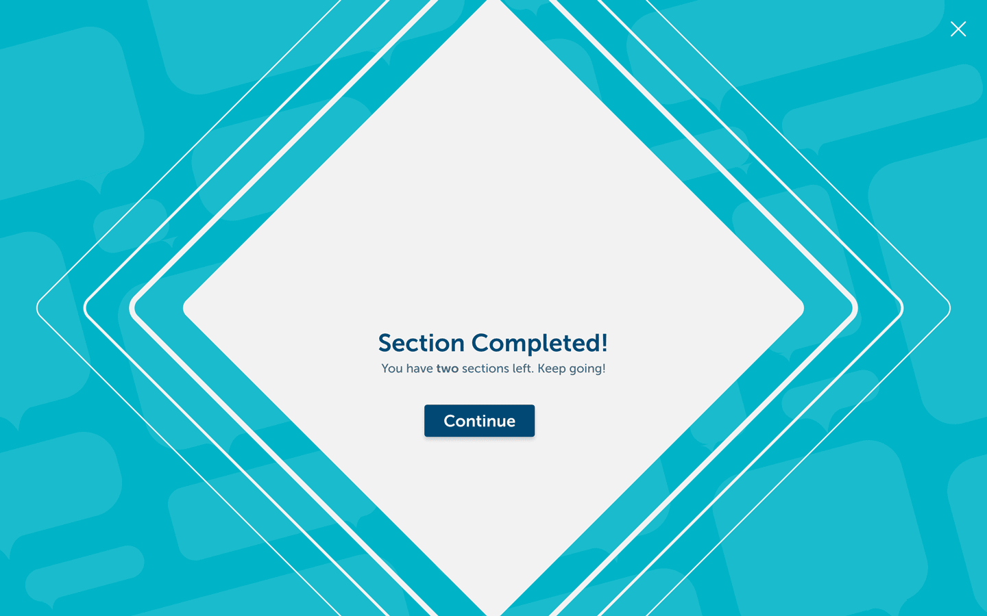
Section completion screen
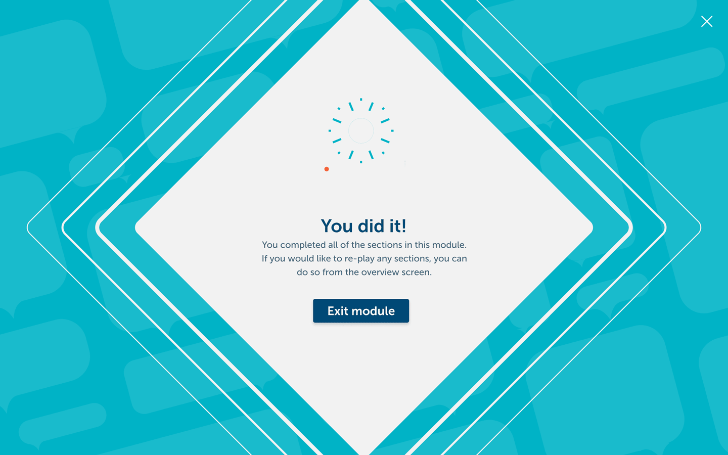
Module completion screen
Looking Forward
Modularity was incredibly important for this project. Though we had the script for one module available during production, inQUEST has plans to add more modules to their platform, each with its own set of unique content. While the hope is that the templates provided are sufficient for any type of content future courses call for, the interface as a whole is designed for flexibility. The client was extremely pleased with the content we delivered, and the designs have since been integrated into their proprietary modular back-end.